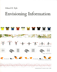
Book Review: Envisioning Information
It tells a lot about an author when you learn that being dissatisfied with the quality of what a publisher could offer, he started his own publishing house. That author is Edward Tufte, professor emeritus at Yale University. Recently I had the real pleasure of reading one of his books: Envisioning Information.

My reading began with a slight disappointment. The book was recommended to me when I attended a workshop on interaction design by Bruce “Tog” Tognazzini. So I was hoping for a guide on how to effectively present information on screen. But Tufte doesn’t even aim for that goal.
He virtually dismisses the computer screen as a medium for presenting information. The book was published in 1990, so his comparison of computer applications from that time to a “grim parody of a video game” is very correct. Sadly, even modern displays can’t compete with the resolution of Tufte’s favorite medium: paper.
The attitude omnipresent in the book seems to be opposite to the trends typical in web design. The mantra of web usability is to let the user access key information quickly and effortlessly. While the goal itself is very worthy, it typically results in what Tufte calls “posterization”: limiting the amount of information presented in order to make it more “friendly”. Posterization is often accompanied by superfluous ornamentation that obscures its meaning.
Fortunately the author doesn’t stop at criticizing today’s trends. The book is a wonderful catalog of carefully crafted designs. They range from traditional Japanese calligraphy textbooks to train schedules. Each piece is accompanied by a description that puts the work into a broader context. Often it’s a journey showing how visualization of a certain aspect of our world has changed through the years. A good example from the book is the evolution of sunspots depictions, from 17-century drawings by Galileo to today’s computer-generated images from NASA. Tufte proves that the dry topic of statistical data can be told as an engaging story. He holds to his own saying: “If your numbers are boring, then you’ve got the wrong numbers”.
However, Envisioning Information is more than just a catalog of obscure images. The book describes few principles of information design that can be applied to any medium, even as barbarian as web browser window. Tufte shows how to use color, outline, text and other means to effectively visualize dense, multidimensional data.
Some of these principles could be applied directly in many areas of design. One is less tangible than others, but seems to be present throughout every page of Tufte’s book: respect for the audience.
I noticed something contrary among designers and web developers who assume that people “don’t read on the web”, have a short attention span, or are just plain stupid. That notion is so prevalent that it affects many designs found on the web. It also forces designers to remove important parts of the message and “posterize” it by favoring ornamentation over information.
Of course it doesn’t mean that all the efforts to simplify designs should now be dismissed. Yet, there’s a lot to learn from old media for the web design crowd and Tufte’s book is a great guide through the history of solving design problems. The book gives a thought-provoking perspective on the subject of information design. And even if it won’t change your way of thinking, it’s definitely worth reading for the sheer richness of its content.
Krzysztof Dabrowski
Nice review. Have you read the story about London’s tube map? It’s also regarded as one of the design pearls. It’s dense, content rich but yet easy to understand and somehow pleasant. Certainly not a typical property of other metro maps. (Apart from Warsaw’s map ofcourse which is …well…. simple? easy? concise… :) )
Szafranek
Yes, I read about tube map.
Warsaw underground doesn’t need any clever tricks to be visualized on a map. It has built-in simplicity. Maybe we don’t get a second line because nobody wants to spoil its ingenious design? ;)
Olle Jonsson
Tufte’s a genius.
He loves paper. Whitespace. Shapes that guide the mind. A chart has its own rhythm, as does a (data) table. It’s mostly in selection of right elements that great design appears; removal.
Saving ink, and trouble for the reader.
I really dug those train timetables he wrote about.